Although your ad may look great on screen, the files required for print are very different from those suitable for digital publication. To better understand the reasoning behind those requirements, it helps to understand how a commercial press operates. To demonstrate, let’s follow the print-process journey of a full page ad for a standard-sized publication at Innovative Publishing (8.375 by 10.875 inches) through the print process, so you’ll know how to effectively translate your advertising message to the final glossy page.
You’ve crafted your message, you’ve perfected the visuals, and you’re satisfied with the final design. Our team has placed your ad in the publication layout, and now it is off to press!
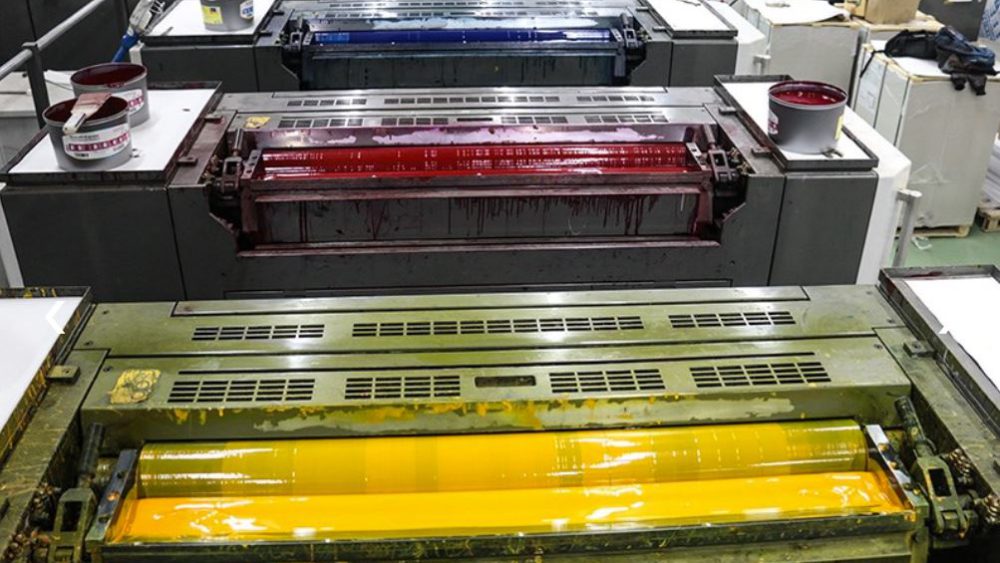
A majority of our association publications are printed on sheet-fed printers like this one.
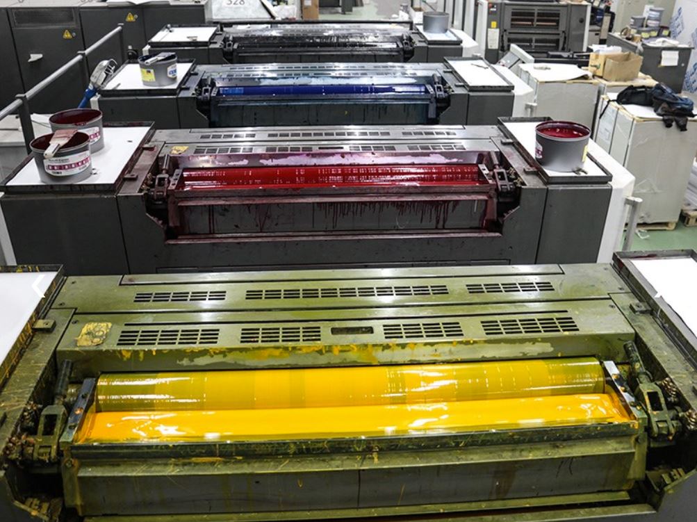
Generally speaking, an extra-large sheet of paper is fed through the press, and ink from four different cylinders (cyan, magenta, yellow and black) is applied to that paper to generate the thousands of color variations that make up the artwork. This is why it’s important to create your advertisement using CMYK colors. Unlike on a computer screen, where color displays in RGB (red, green and blue), printed color is made up of different combinations of the three subtractive primary colors (cyan, magenta, and yellow) plus black. So, all artwork must be converted into CMYK values to be read by the printer.
Innovative will convert all ad artwork into CMYK proofs for our clients. Most of the time this works well, but on rare occasions it may drastically alter the appearance from what you see on your screen. While both RGB and CMYK have similar ranges of colors, some colors such as a neon or fluorescent color in RGB may look dull when printed in CMYK. For that reason, it is ideal to design your advertisement in a software program specifically made for creating print-ready artwork.
If you are using Adobe Photoshop, converting to CMYK is easy. Go to the image menu, mode, and select CMYK. If you are building your advertisement in Adobe InDesign or Canva, be sure all of the individual elements that make up your ad are built in CMYK color as well, including each photo, logo, piece of text and graphic element. You can use online color pickers like this one to determine specific color values. Enter those color values into the software you are using to ensure a perfect match. And, if you are using Canva, be sure to save your file download as a print PDF and choose CMYK color profile during export.
A special note regarding black ink: Since black is one of the four printing colors, you might think to use 100% black ink for every instance of it in your ad. However, if you have a large area like a black background, it is best to use a combination of all four printing colors to create that black rather than 100% K. If you were to use just black ink, you may end up seeing some lines in it from the print rollers, and the resulting color would appear flat and possibly faded. Using four-color black, or rich black, allows each of the ink colors to be applied at different angles. A common makeup would be 50% cyan, 40% magenta, 40% yellow and 100% black. This will:
- make it less likely to see the line screens from the rollers since they are being applied from different directions,
- allow for better ink saturation, and
- result in a deeper, richer black color output.
For text, however, the opposite is true. If text is made in four-color black, that means all four inks will be added onto each tiny letter. That is a lot of ink and could result in the type looking blurred around the edges. Certain programs like Microsoft Word default to a rich black, so double check that this has been adjusted to 100% black before submitting your ad.
Once the ink is applied, that extra-large piece of paper rolls off the press and could look something like this.
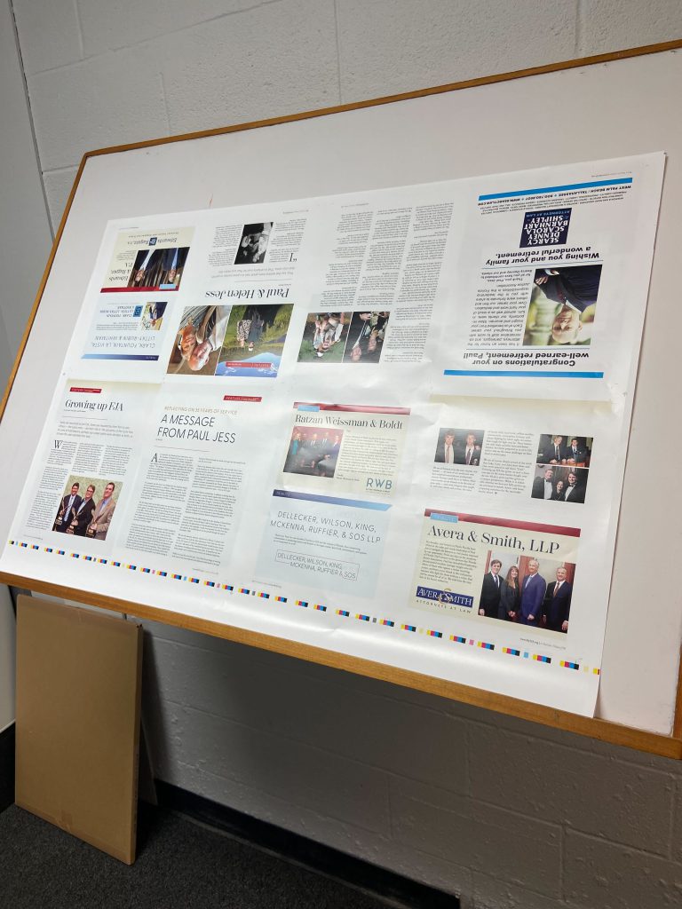
Eight pages fit on one side of the paper. After it dries, the paper is then fed back through to be printed on the other side, resulting in 16 pages per sheet. In this process, the printer is balancing all of the color in each advertisement and editorial page with the rest of the content on the surrounding eight pages. It is up to your Innovative team and the printer to find that balance, so providing a correctly built file will ensure that your ad prints as expected.
“One thing that we’ve noticed in our industry is that we’re bringing in a whole new generation of designers, and we’re having to educate them on how the photo is going to affect their logo, or how the page above is going to affect the page below it when you’re printing things as 16-page spreads,” said Brian Houchens, CEO of Welch Printing Company in Louisville, Kentucky. “If the page below might need cyan, the page above might need magenta, so you’re kind of fighting those two elements. It’s a balancing act.”
From there, the paper is then folded and/or trimmed to size. This is where it becomes important to set your document margins and bleeds correctly. Set up your document with guides to help you place artwork in the right spot.
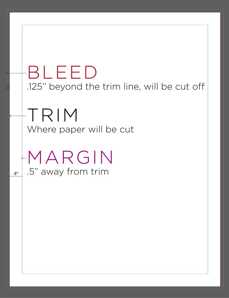
For a full-page advertisement, set 0.125 inches of bleed on all four sides. This area is intended to be cut off, and its purpose is to ensure that your artwork fills the page edge to edge after being cut. For a full-page ad, then, the total dimensions including the bleeds becomes 8.625 by 11.125 inches. Extend any background colors, images, or designs that you want to reach the edge of the page into that bleed area.
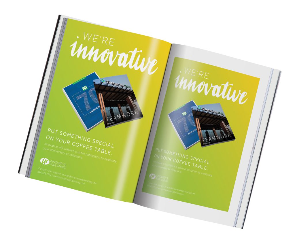
Without correctly adding bleeds, you might end up with unwanted exposed white paper around the edge of your ad if the cutting process isn’t perfectly aligned. If you do not have access to any print-ready design programs, one option is to produce every page with an intentional white border. If your document has no images or graphics that extend past the edge of the page, a printer will be able to work without bleed and crop marks. Another option is to send the Innovative team your background image(s) separately from the other elements so we can extend the artwork into the bleed for you.
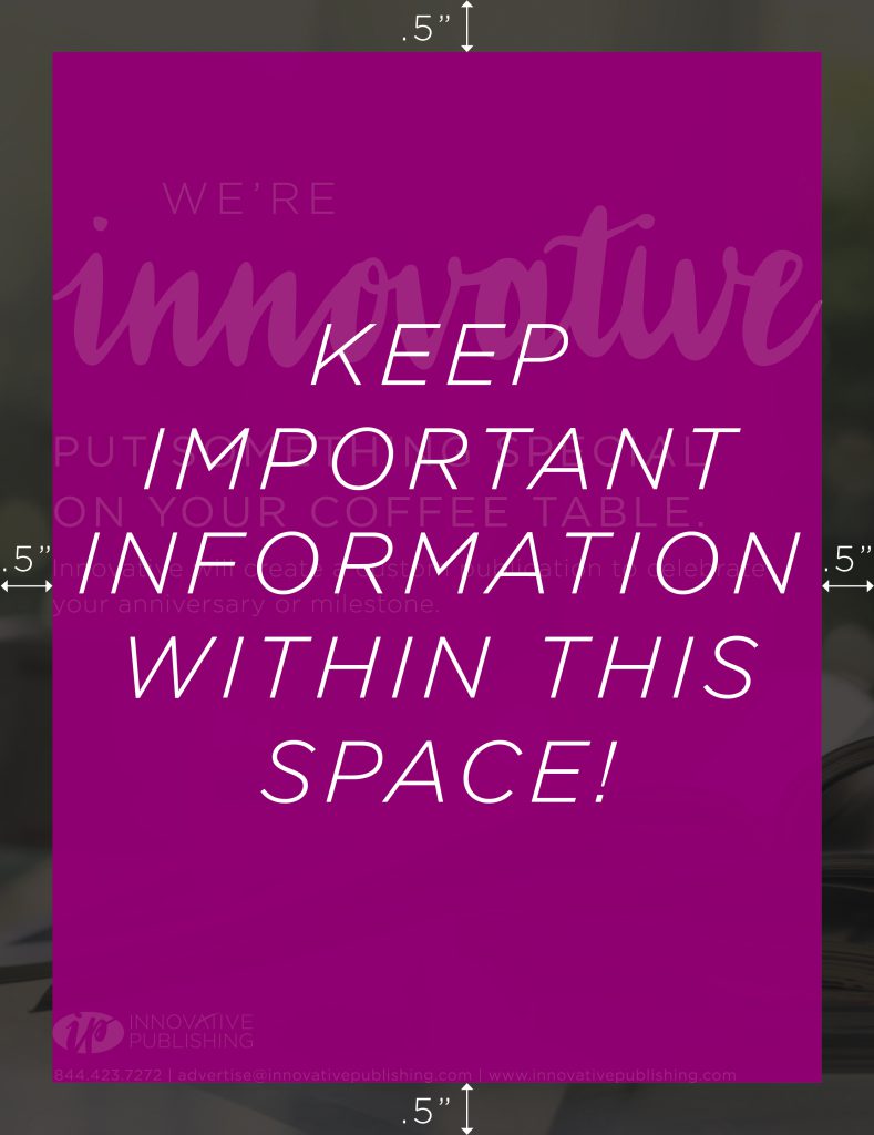
At the same time, you will want to keep important elements and text away from the edges, or trim line, to avoid them being cut off. Our standard is to keep a half-inch margin around all sides so that regardless of the publication’s binding type, your text will not be cut off at the top, bottom or outside edge, or lost in the gutter (middle of the spread).
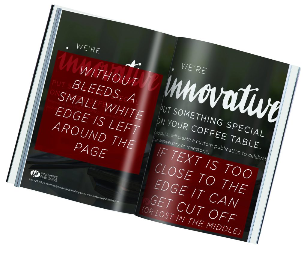
There are three typical binding types you’ll see on an Innovative publication — saddle stitched binding, perfect binding, or spiral binding.
- Stitched binding allows the most flexibility when it comes to the middle of the publication, or the gutter. You can typically press the pages apart flat without losing much information across the middle. You should still keep information within your margins, though, because of something known as “push.” If you have a publication with a lot of pages, the pages in the center will actually be ever so slightly smaller to keep the overall publication dimensions 8.375 by 10.875 inches when folded together, hence pushing your artwork closer to the edges.
- In perfect binding, you may lose information on the inside edge of the page because the pages are glued together along the spine. Like in saddle stitching, larger publications will require more margin to avoid this area of the page. “When something perfect binds, it collates together, and you have what you call a grind. It grinds the edge of the sheet so the glue will adhere to it and then the cover is put on,” Houchens said.
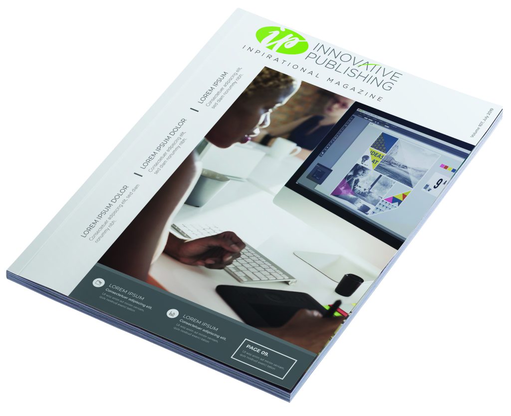
- Spiral binding is where you will need to be the most careful. This is because the inside edge of the pages will be punched through with a spiral coil through it. That means anything on the left or right side of your ad that isn’t in the safe zone may possibly have holes punched through the page, impacting legibility and how artwork is viewed.
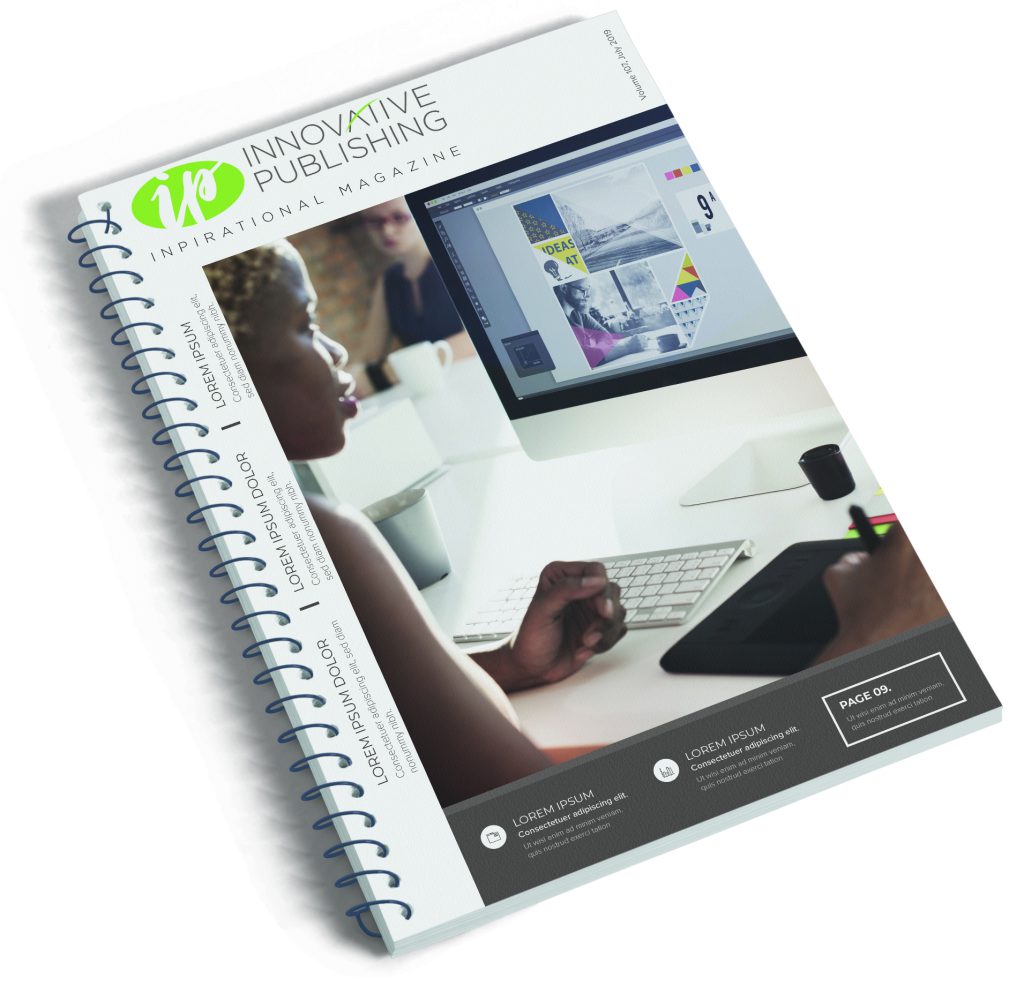
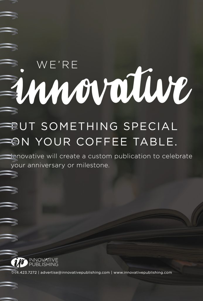
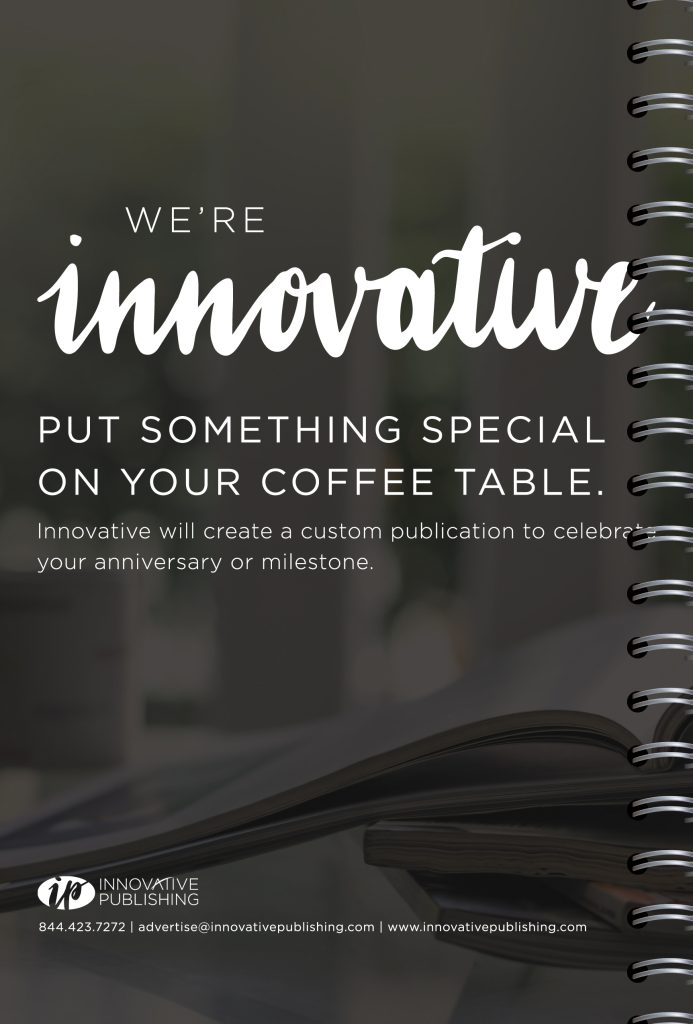
It is best practice to keep half inch margins on all sides so no matter what side of the publication your ad is on, information is not obstructed by the coil binding
By abiding by that half-inch margin rule, your advertising information should not be in danger no matter what page or position your artwork lands on. This allowance is fairly generous for a saddle-stitch or perfect-bound publication, and a minimum requirement for a spiral-bound publication.
For ads that are less than a full page or back cover size, the above does not apply. Half page ads and smaller do not bleed, and your artwork can go right to the edge of your document size. This is because your ad dimensions are set based on the publication size with allowance for margins, page numbers and other page elements around it.
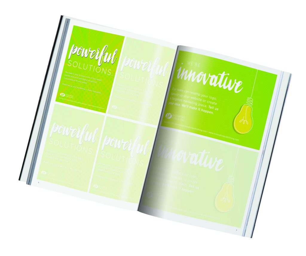
One other important factor that ads of any size must consider is image quality. The standard for printing is 300 dpi, or dots per inch. This value refers to the number of dots that are printed within a square inch of the paper. The higher the DPI value, the higher the printed dot density, and the higher the resolution. High resolution produces sharp, detailed images. Images that are below 300 dpi may appear soft, pixelated or blurry when printed. This is why it is important to use the original or largest graphics files available when building your advertisement. You or your Innovative team can change image resolution to 300 dpi in Photoshop, but if the image was poor quality to begin with then the ad won’t look nice at sizes suitable for a printed advertisement.
Your Innovative team will always flag you if we notice that any elements need adjusting to accommodate the publication’s specifications. While it may take a bit more effort to track down quality images, correct color and adjust placements of elements in your advertisement, the time spent will produce a professional result you can be proud of. “There’s never enough time to do it right, but there’s always enough time to do it over,” Houchens joked.
Catherine Meany is the design manager at Innovative Publishing. Reach her at catherine@innovativepublishing.com
“Like” what you read? Subscribe to our blog here and don’t miss an update!
Related Posts:
Full Page Ad Specs
Make the Most of your Print Advertisement
How to Take Great Photos for Print

Comments are closed.