While working with our clients through the years, we’ve learned a lot about rebranding. We know that a rebrand isn’t just about a fresh new look, updated fonts and vibrant colors. It’s really about knowing who you are, and sharing that in a way that gets people excited. As we’ve grown and learned from our clients, we’ve gotten a clearer picture of who we are and what our work means to us — and we think it’s the perfect time to reintroduce ourselves.
We’re Innovative.
Our rebrand started with getting clear on how we wanted to present ourselves. As the services we offer clients have evolved, we wanted our website to be more informative and explain what makes our process special.
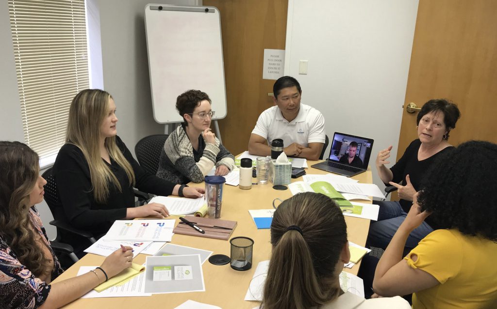
Once we had a clear outline of what we wanted to communicate about ourselves and the information that would be most useful to clients and advertisers, we needed a way to capture that visually. Our marketing team includes our graphic designers, who each developed several logo options. They presented them to Owner and CEO Aran Jackson and Owner and President Theresa Jackson.
The design that resonated the most was our company initials in brush script, handwritten by designer Catherine Meany. We reviewed how the logo looked in different colors, and went with the fresh and vibrant green you see now. The handwritten element of our logo expresses a few things about our business.
First, part of what makes our business special is that we bring a personal touch to everything we do, from custom design to one-on-one collaboration with the client’s editor. Our logo is our way of putting our signature on everything we do.
Second, we’re all about attention to detail. We talk about how we dot every “i” and cross every “t” to make sure publications are worthy of our clients and their association members. This philosophy carries through our modern approach to design, multiple sets of eyes during proofreading, and careful handling of production details. A green line matching the oval of the brush script logo crosses the “a” and “t” and dots the “i” in Innovative.
Finally, our logo calls out the fact that we work in an old-school medium, but we’ve innovated for today’s needs. We embrace print. It still has incredible value, especially in the association space. Handwriting fell out of fashion as communication moved to email and social media. But recently it’s seen a resurgence. Modern calligraphers use paper, pen and digital tools to reclaim hand lettering as an art form in bullet journals, Instagram feeds, and YouTube channels.
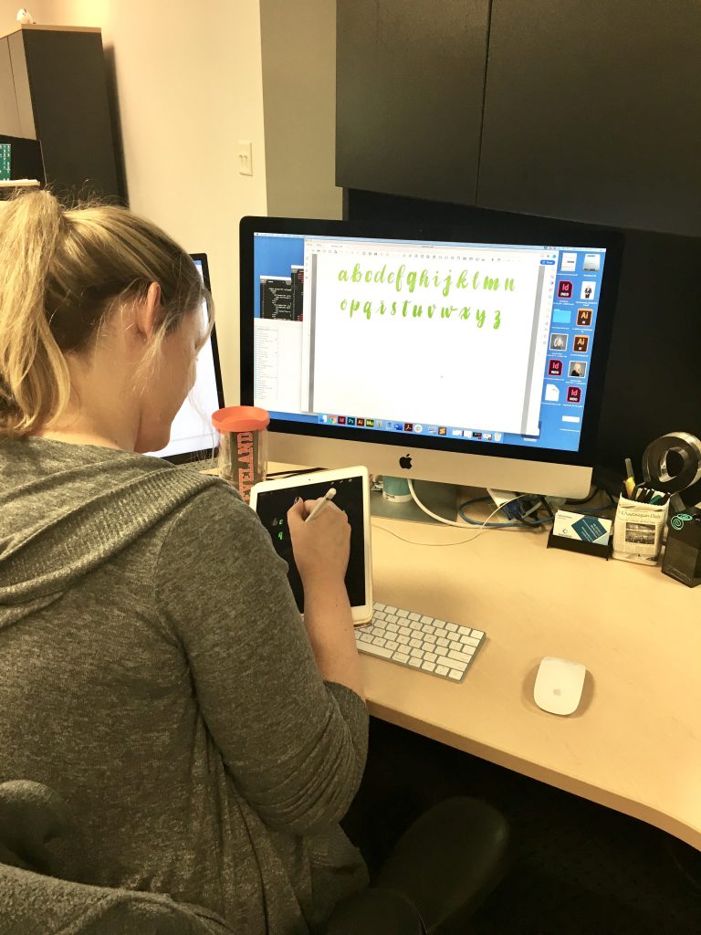
After we decided the lettering would be part of our brand in other ways, we asked Catherine how difficult it would be to create an entire font. “Very difficult,” Catherine said. And yet soon after, she had an entire alphabet done.
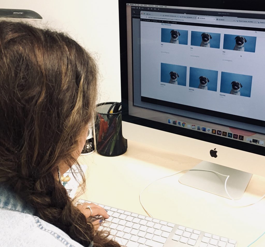
We had copy written by me and a rebranding plan mapped out through a collaborative effort with Catherine, Adrienne Manlove, Molly Dixon, Daniel Owsley and Shannon Patterson, and we needed to put it together for our website. Molly set out to develop a wire frame to optimize functionality on our new website. But in typical Innovative fashion, by the time the next marketing meeting rolled around, Molly had just about finished the site.
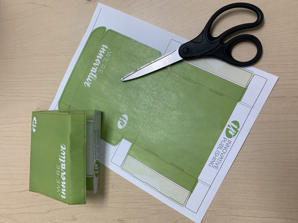
The new logo meant we also needed to update our internal forms, which all the designers worked on for weeks between other assignments. We had big ideas for custom marketing collateral we could create, including an eye-catching box for shipping magazine samples, materials we could give to potential clients that explain our process, and updated business cards.
We’re excited to share our new look with you! And beyond that, we’re eager to show how we can serve our clients in advancing their work. Check back for resources that will help you empower your marketing message. And as always, we’re happy to hear from our clients (and potential clients!). If you’re interested in revitalizing your own marketing efforts, email aran@innovativepublishing.com to learn how we can help.
Liz Herrera Lauer is senior editor at Innovative Publishing. Reach her at liz@innovativepublishing.com.

Designer Catherine Meany fine-tunes her hand-lettered Innovative font, which is used throughout the new branding. 
Miniature mockups of marketing collateral help the design team visualize projects. 
Designer Molly Dixon opts for pug photos as placeholders in an early website draft. 
The marketing team meets with Innovative Publishing owners Aran Jackson, CEO, and Theresa Jackson, president, to finalize the new logo.

Comments are closed.